Senior Capstone
Proposal:
I am designing a full package design on the collection of their products and a brand website that would allow customers to purchase and browse their inventory selection. Brewed Awakening Coffee is an independent coffee company that is focused on producing high quality coffee products for the everyday consumer. One main company goal is distributing their products to local grocery stores, farmers markets, and smaller retailers. This company was created to fulfill the increasing demand for locally produced coffee and coffee-based products, all while delivering a fresh and flavorful coffee experience. The client for this project is the company Brewed Awakening Coffee.
Objectives:
To independently research, design and produce a logo, packaging of coffee canisters, coffee syrup, Canned coffee, websites, and logo branding.
To understand and summarize my research in coffee company’s, incorporating my research into a new and cohesive design across all items on my project.
To apply all that I know and that has been taught to me about the foundations of design including, typography, branding, illustration and package design.
To organize all design components and self-critique those design components throughout the whole process ensuring to improve the designs till the end of the project.
To take all critique given and use it to create a better and more refined design concept.
To create and maintain a clear identity for Brewed Awakening coffee company.
To create and produce a clear and successful design for all deliverables through structure, consistency, and attention to detail while producing perfect craft for all of the deliverables.
To create a presentation showing all my work in a clean, and well organized manner.
Deliverables:
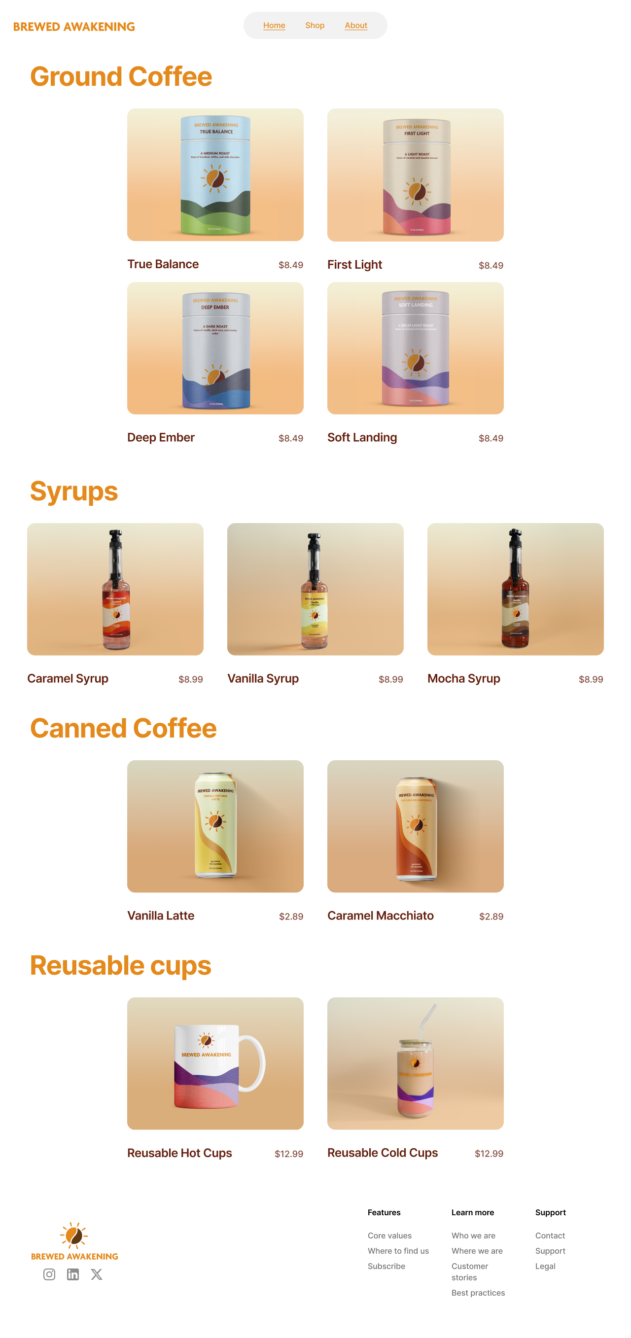
Website with home page and product catalog
packaging for ground coffee, light, medium, dark, decaf
coffee syrups, vanilla, mocha, caramel
Reusable coffee cups both hot and cold (one of each)
Ready to drink canned coffee (2)
2 advertisement signage
Target Audience:
The target audience is primarily people of ages 20 – 35. After prior market research this age range provided the most opportunity for many reasons. One main reason is this demographic of consumers are still establishing what brands they want to remain I their households for years to come. We want to establish Brewed Awakening as the next brand for the future generations. By remaining true to values of this demographic we believe that this brand won’t just be found on the shelves of stores but also on the shelves of the consumer’s home.
Research:
Going into my research for Brewed Awakening, I planned to examine a wide range of coffee companies. I began with major brands like Starbucks and Dunkin’, analyzing how each leverages branding to inform packaging design. I also studied local, smaller coffee shops to see how they approach advertising and web presence with more limited product lines.
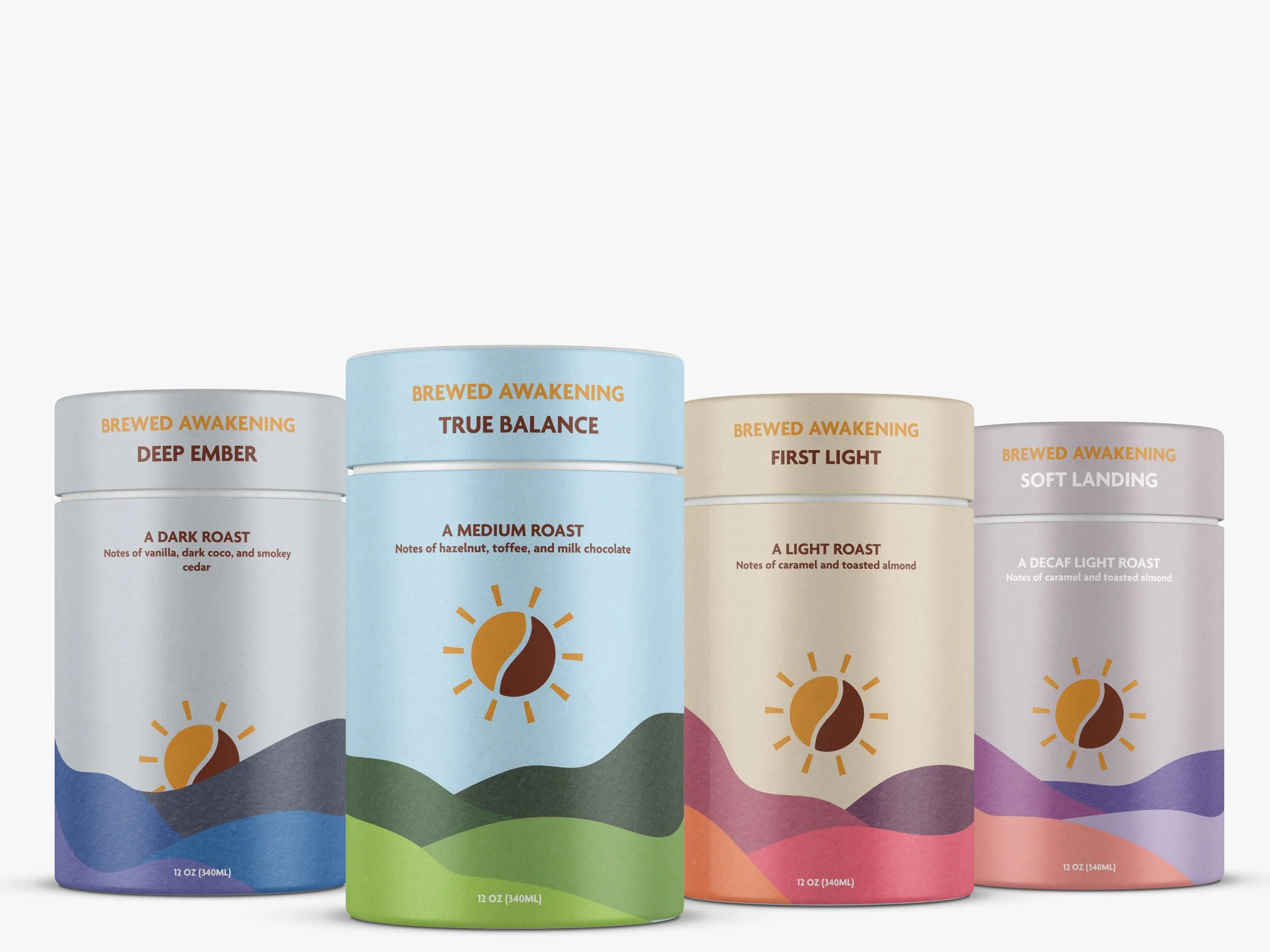
While developing the Brewed Awakening brand, I synthesized influences from established systems, such as Starbucks’ approach to logo variations, and the product organization strategies used by local businesses. I adapted a sun-inspired mark to create distinct landmark motifs for packaging, including a sunrise over rolling hills (coffee canisters), a cave opening (syrup), and a flowing river (canned coffee).
Logo Process
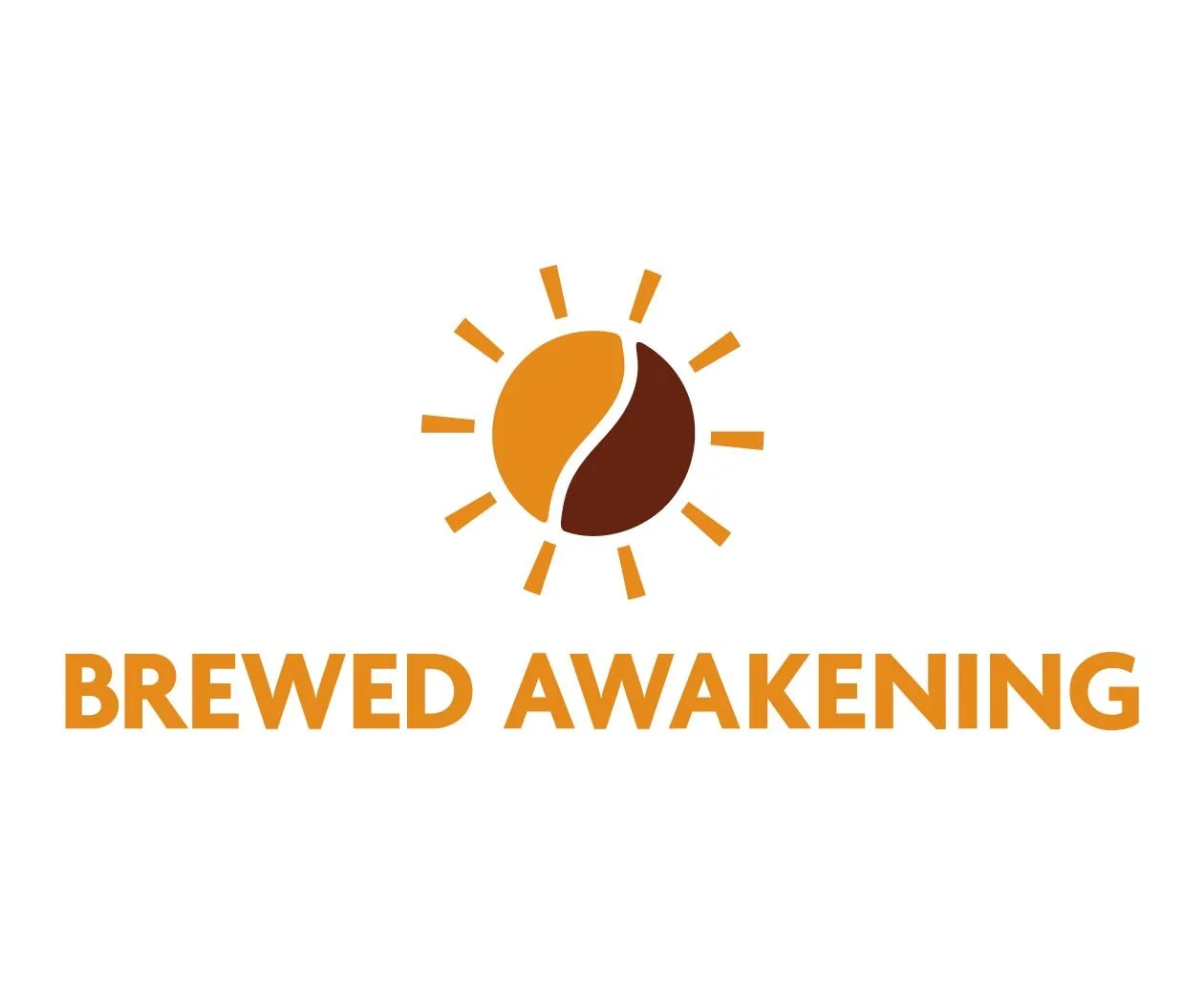
The logo combines the two primary images that come to mind when someone says "coffee", the warm, first-light feeling of mornings and the rich, textured presence of coffee beans. By pairing a sunrise with a stylized bean silhouette, the logo creates a symbol for a coffee drinkers perfect morning.
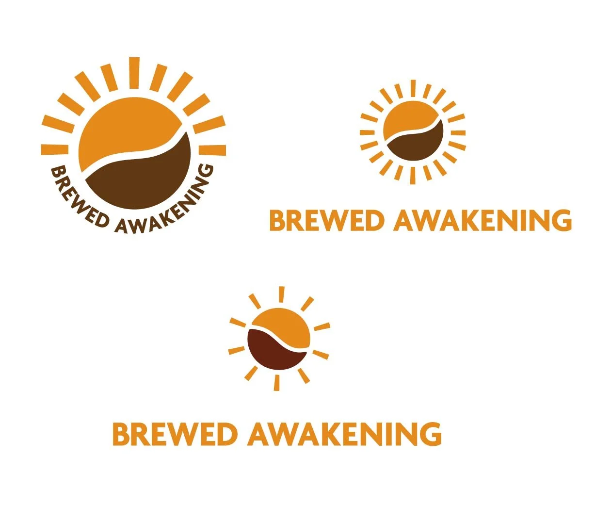
Logo
Flat Version
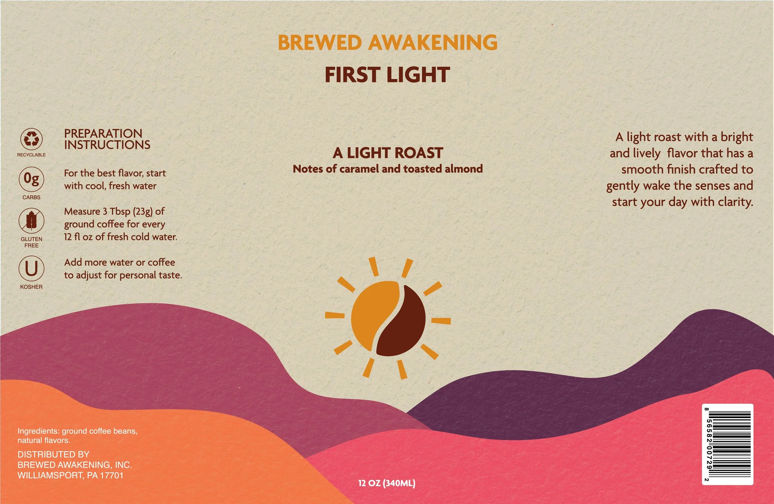
Coffee Canisters
The coffee canisters feature the logo mark as the focal point of the design, each one framed by a serene sunrise or sunset spilling light over a valley of rolling hills; subtle shifts in color palette and the placement of the mark communicate the different roast profiles, allowing consumers to distinguish light, medium, and dark roasts at a glance while maintaining a cohesive design.
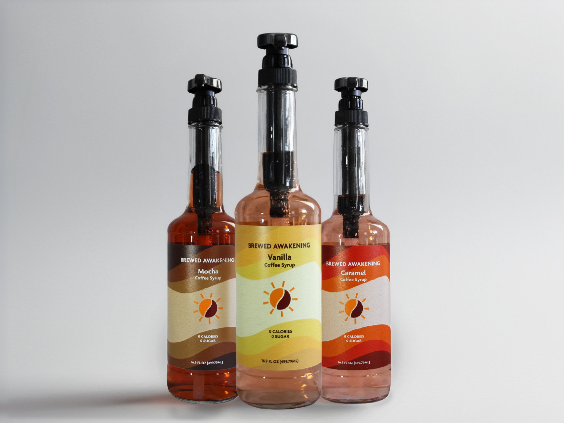
The syrups from the same brand echo the canister design by placing the logo mark at the heart of an abstract cave-like motif, where you see the sun through the opening of a cave. The shifts in the color palette communicate the different flavors so consumers can distinguish varieties at a glance.
Flat Version
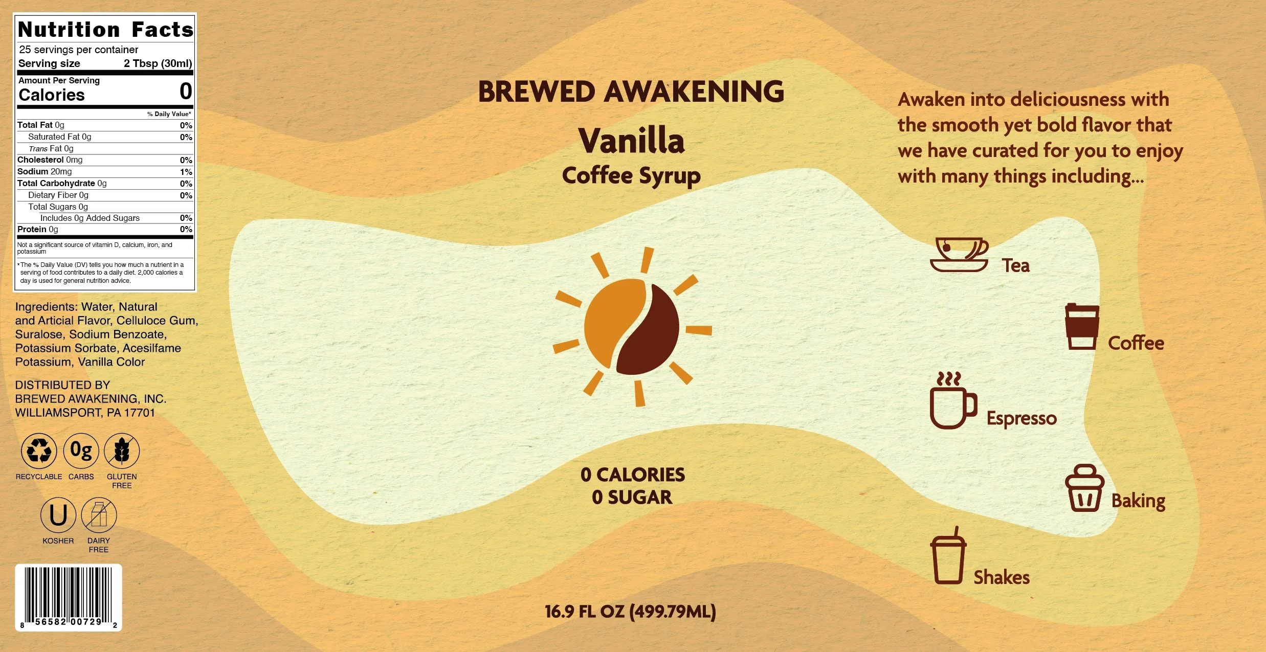
Coffee Syrups

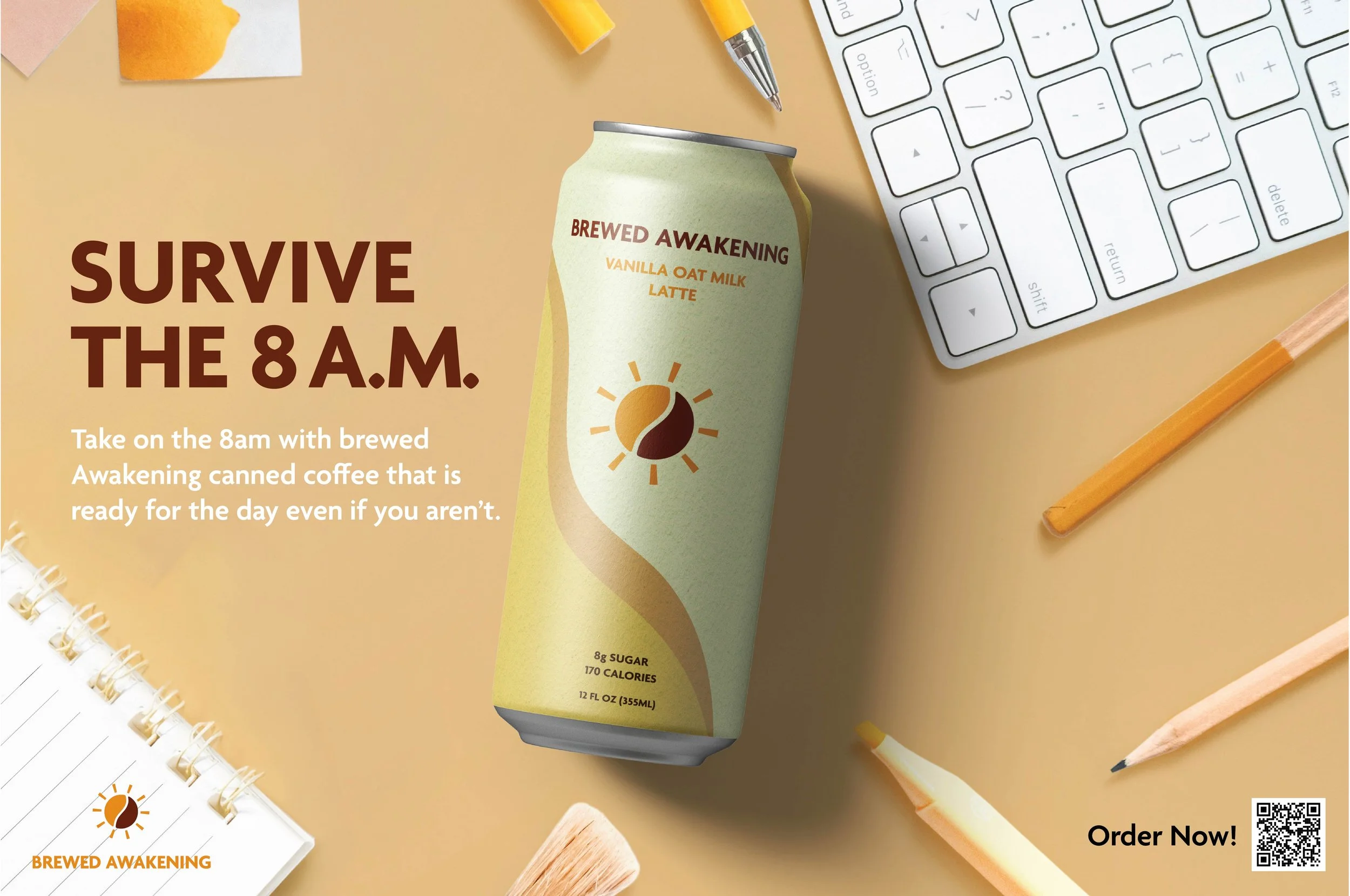
The canned coffee features the logo mark as the focal point of the design, depicting the sun’s reflection on a flowing river. Carefully chosen color palettes complement the mark and align with the brand’s preferred tones, ensuring consistent visual language across the product line. This cohesive approach ties each can to the overarching identity while allowing subtle variations that highlight individual flavors.
Flat Version

Canned Coffee
The advertisement campaign places the Brewed Awakening canned coffee on a student's desk, using the tagline “Survive the 8 A.M.” to convey that, with the product’s convenient portability and dependable caffeine boost, you can make it through early-morning classes and stay alert for lectures and study sessions.
Survive The 8A.M.
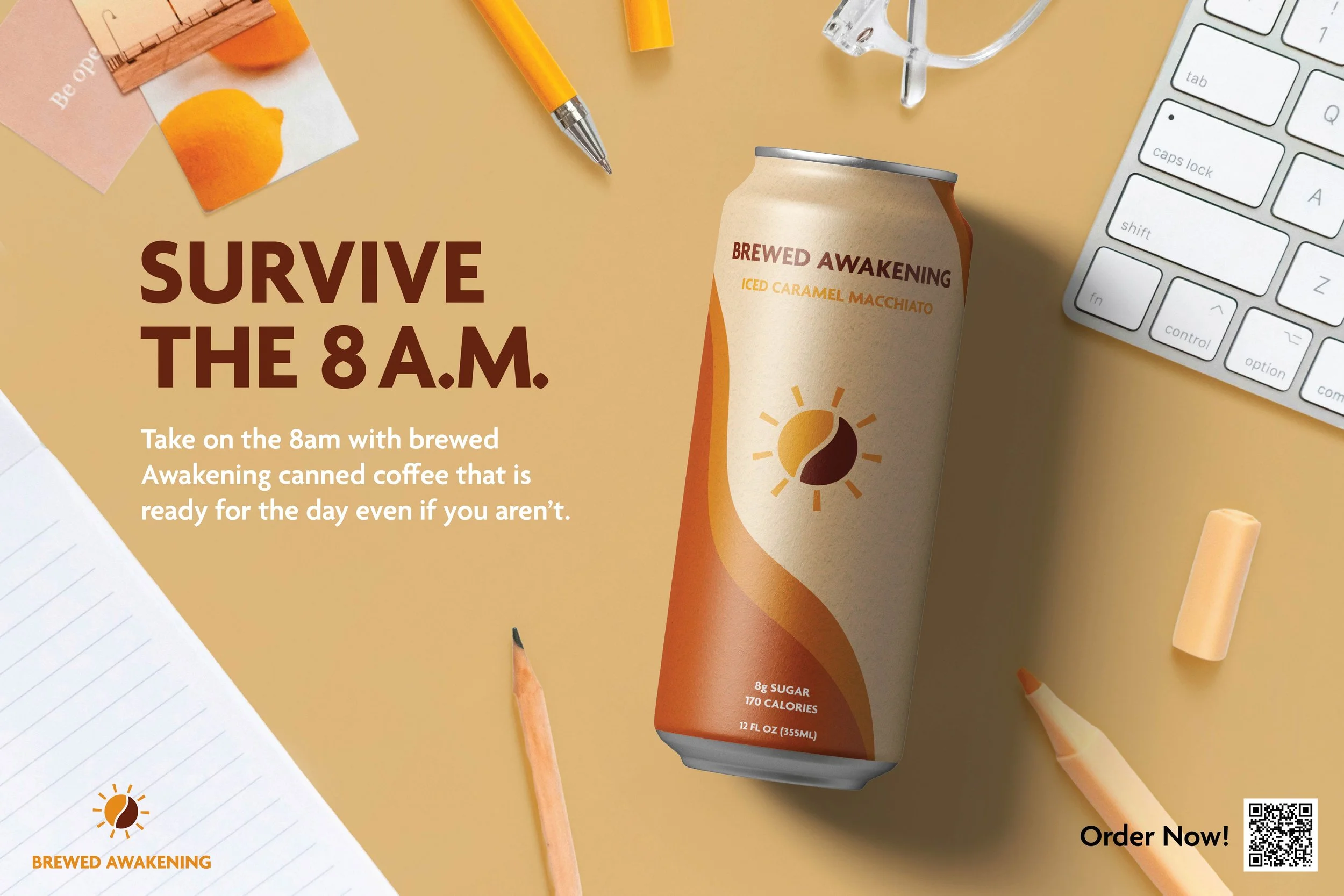
Advertisement Campaign
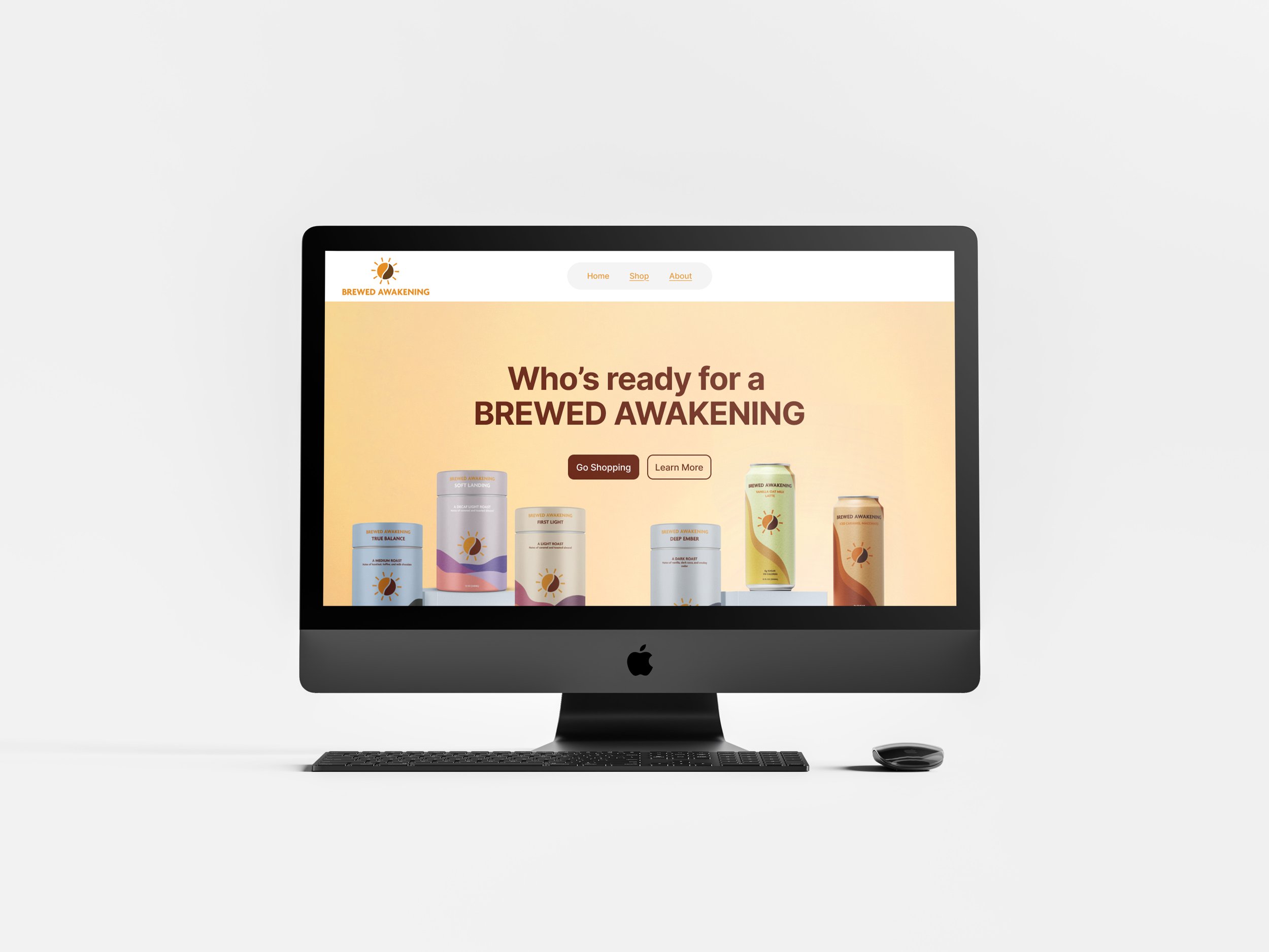
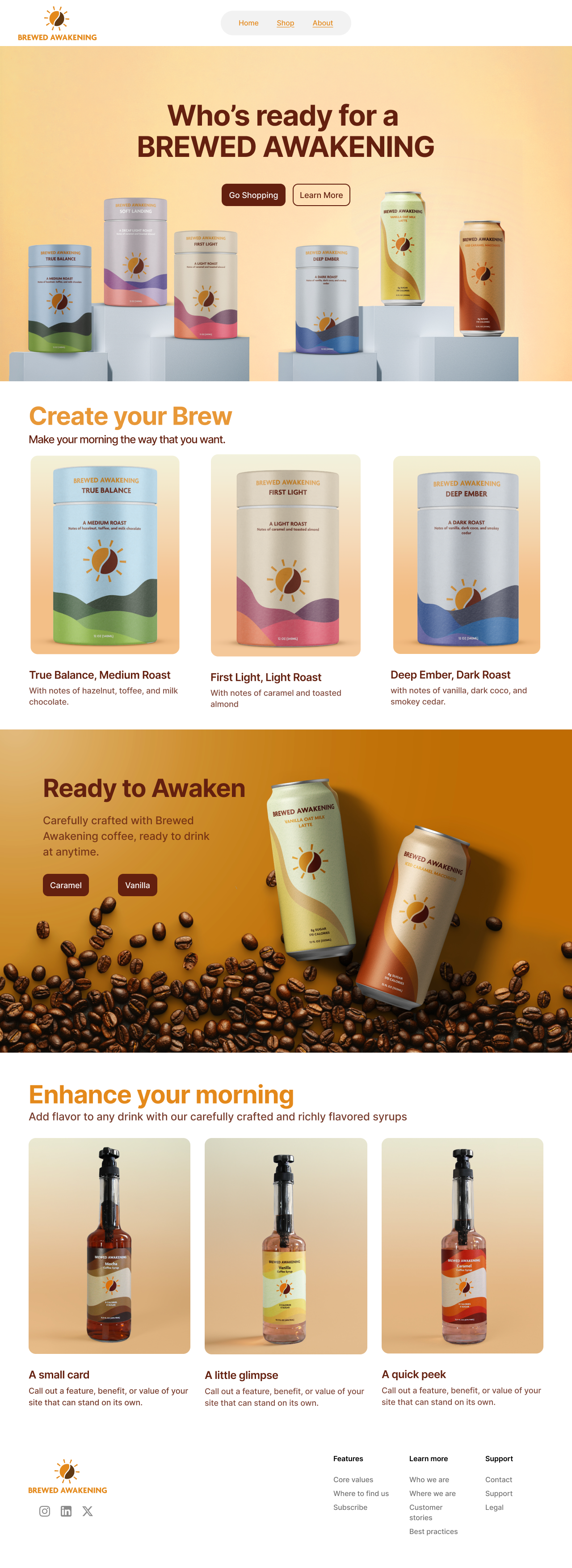
The website for Brewed Awakening lifts the brand to a new level by thoughtfully applying the primary colors across layouts and imagery. Strategic use of those hues guides the viewer’s eye and reinforces brand recognition at every interaction. The result is a vivid, cohesive site that feels both energetic and unmistakably Brewed Awakening.
Click on this link to see the whole website!
Flat Version
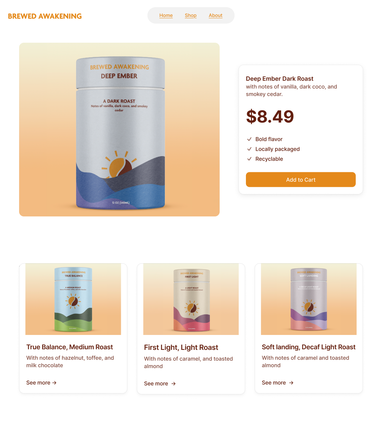
Website
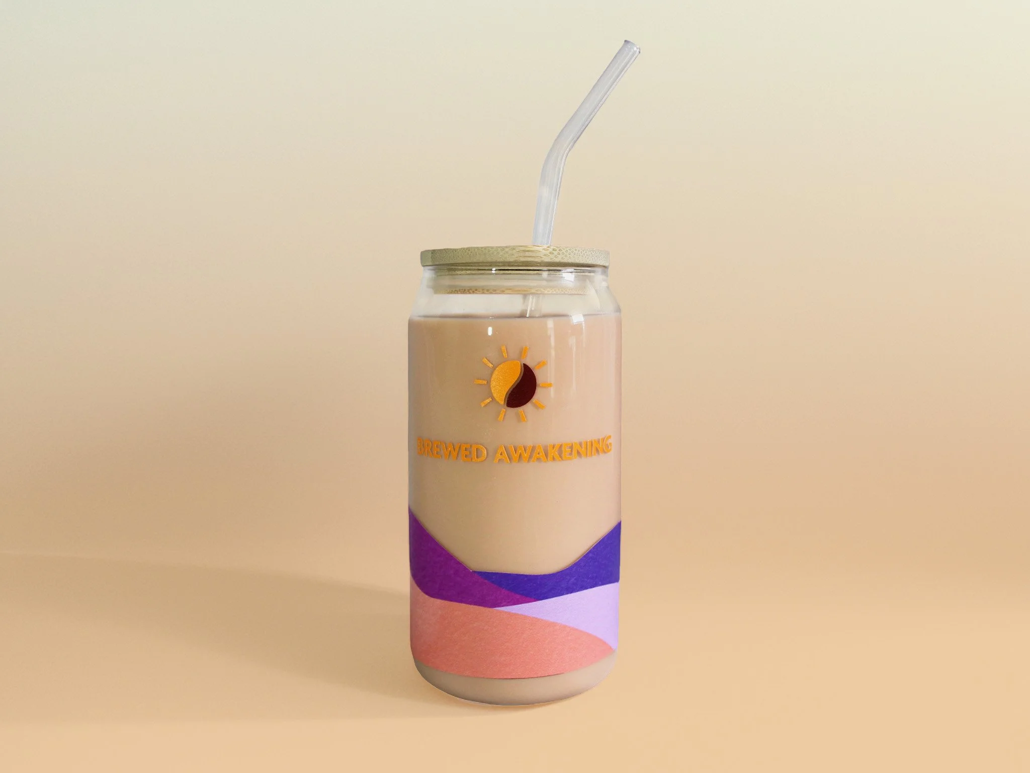
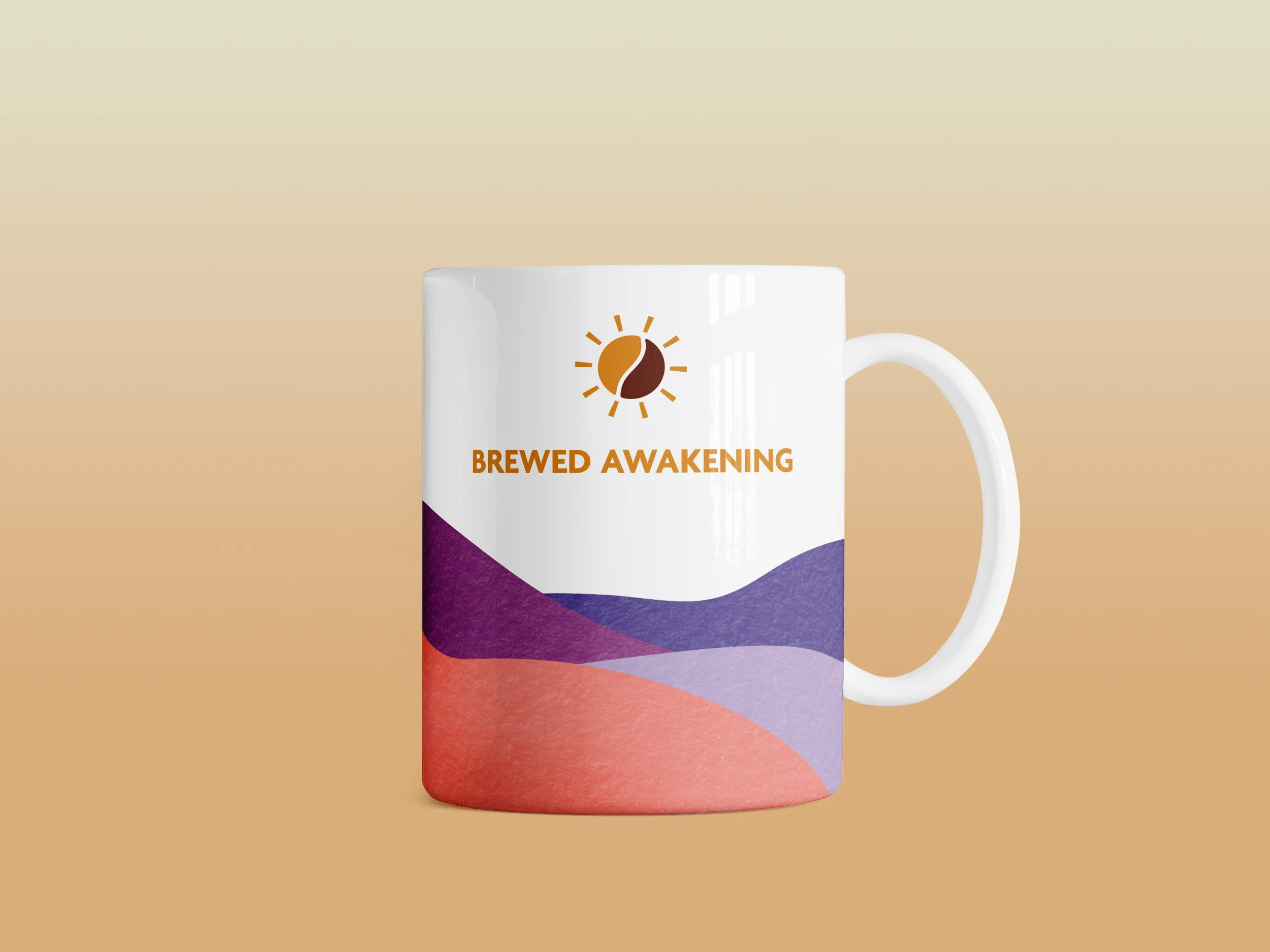
The reusable coffee cups are not the ordinary branded coffee cups with just a logo on them. I used the design for the coffee canisters to further brand the coffee cups, tying it back into the brand identity.