Blackwater Distilling
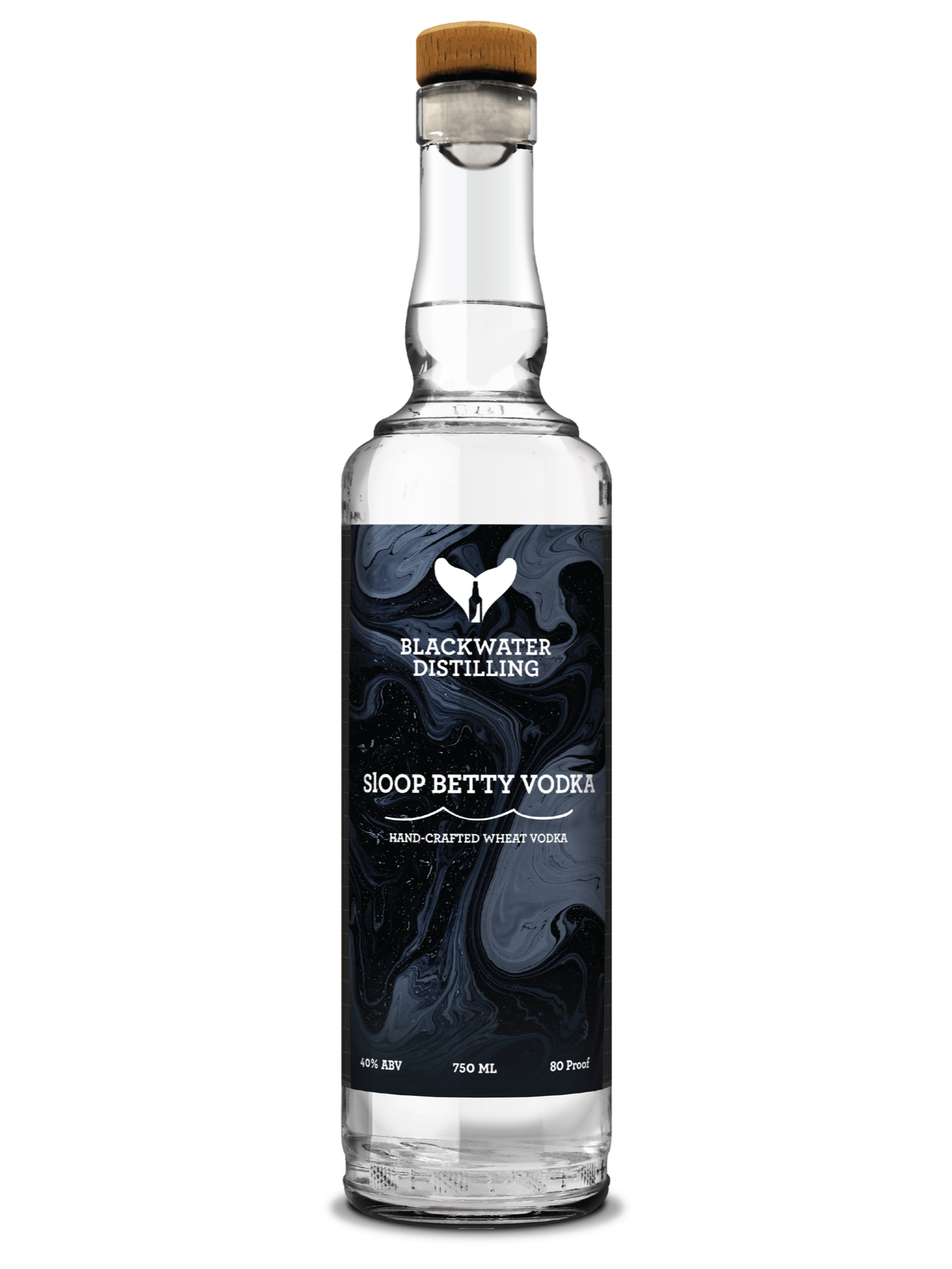
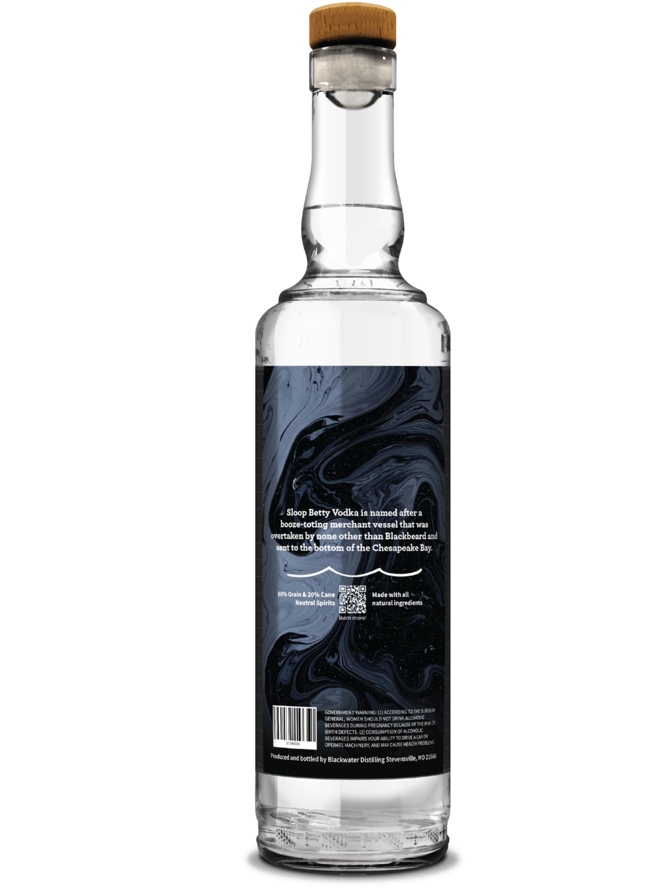
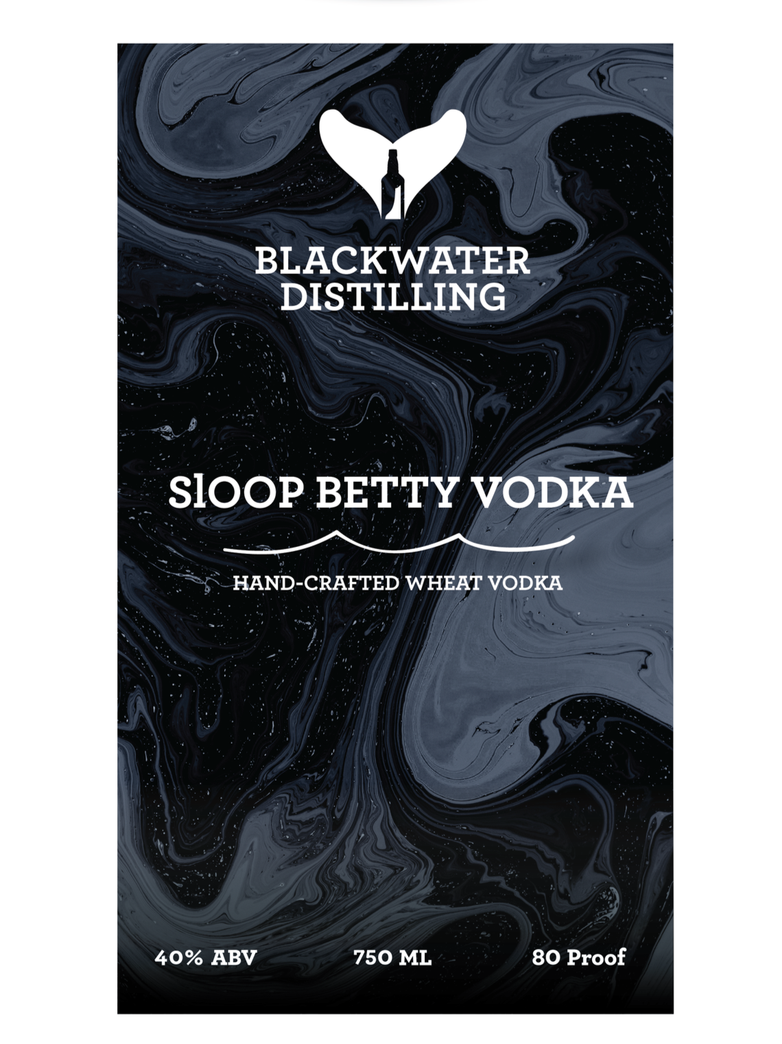
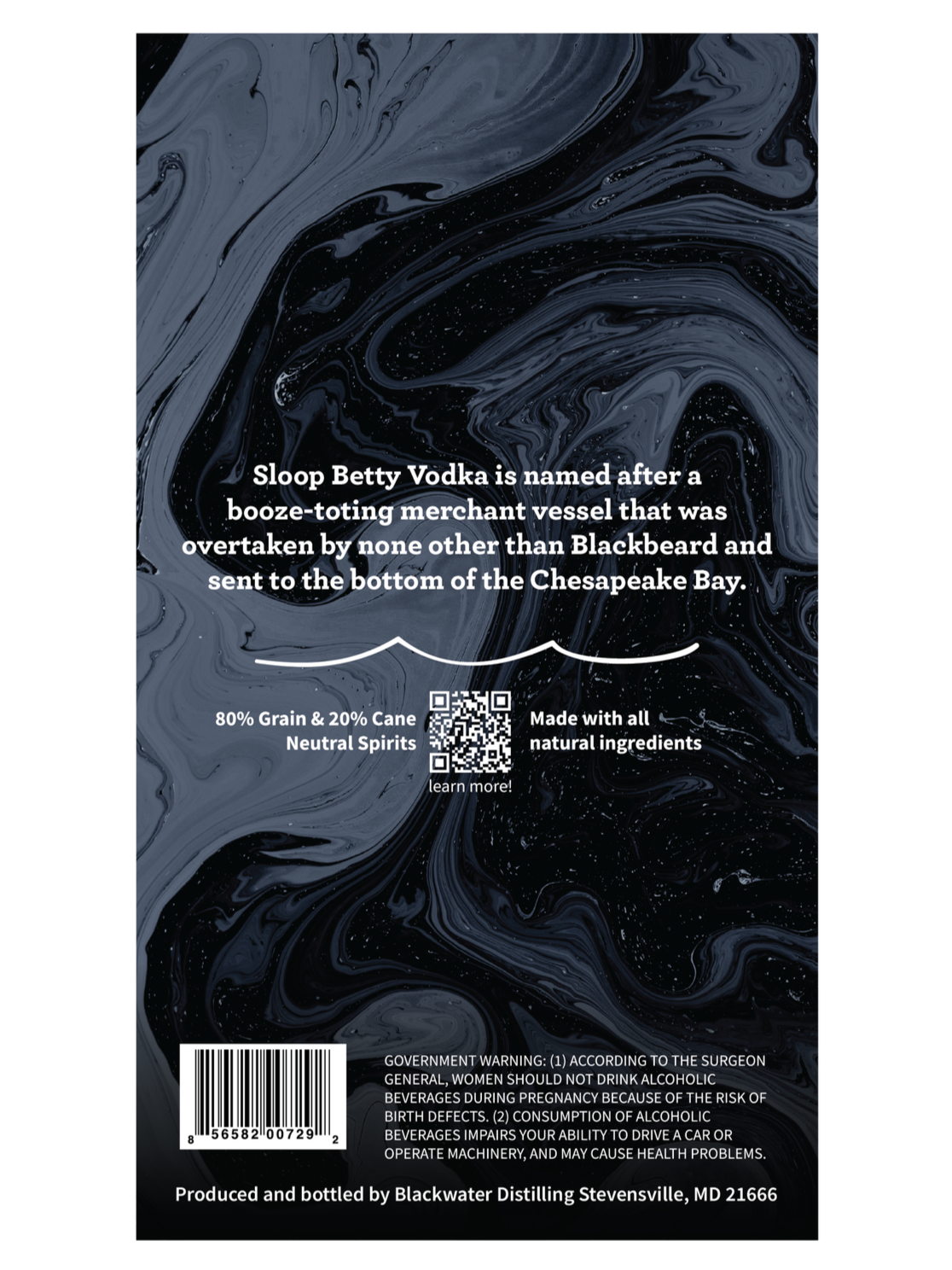
Creating a design that balances clarity and mimics the look of the deep sea is what this packaging is all about. With the design having ample white space, consistent typography, and a limited color palette that prioritizes content yet still guides the eye through the label.